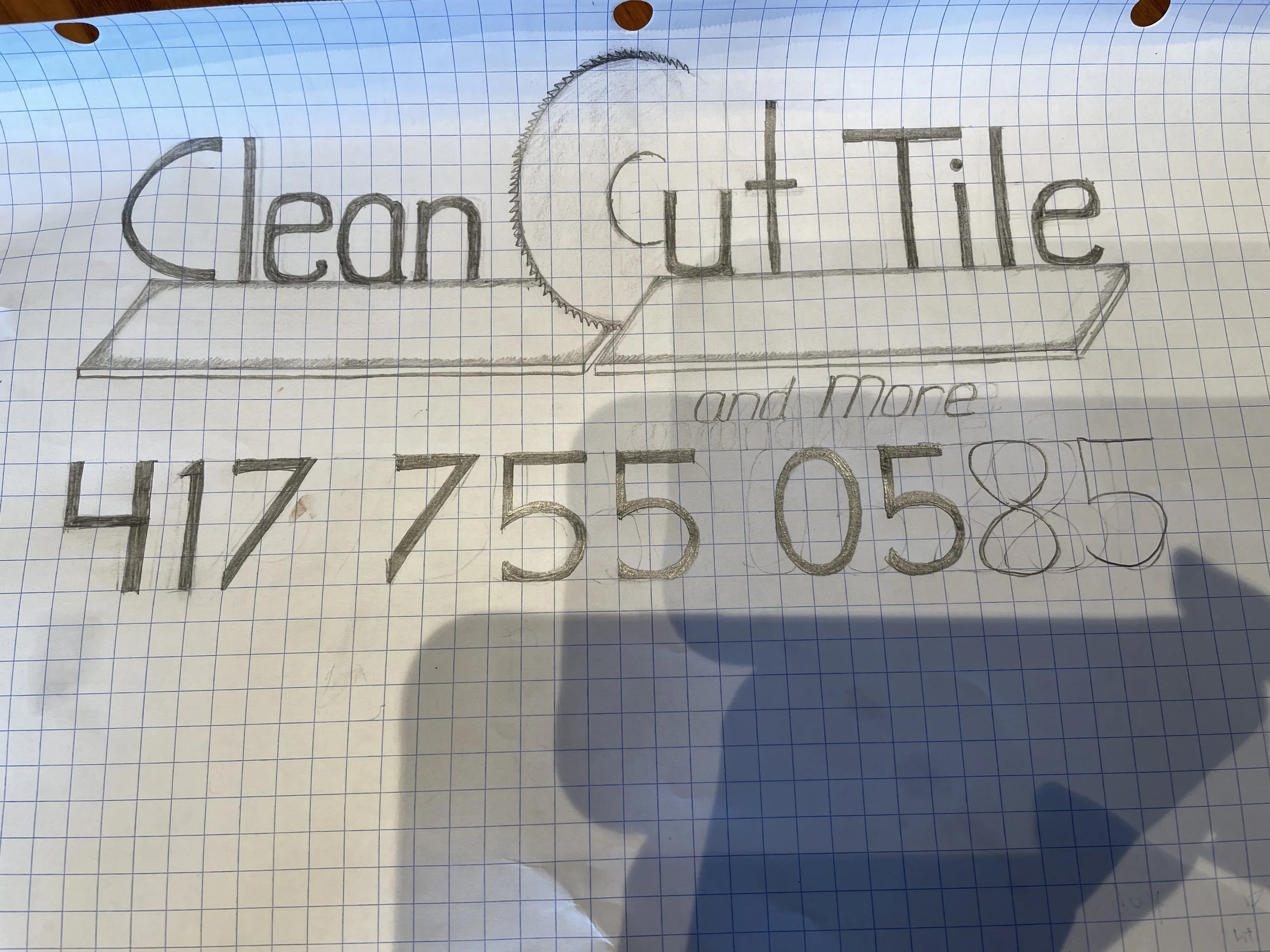
When the owner of CleanCut Tile and Flooring in Richmond, KY first met with me to discuss creating a new logo for his business, he brought this sketch of an idea his wife had:
He also knew that he wanted the logo to be yellow and gray, but he was open to seeing other design ideas. So I mocked up a variety of options using the saw concept, but threw in a couple of alternative ideas as well, just to give him a good variety to choose from:

Ultimately he decided to go with the option that most closely matched his wife’s original idea, but I since that design is very wide, I also included a more square variant, as well as a badge so that the visual identity could be as versatile as possible.
